Light Color and Visual Well-being: From Perception to Simulation
Light does more than illuminate — it shapes our perception of what we see.
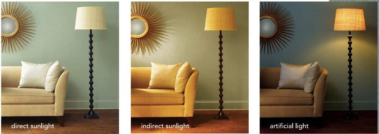
At the same intensity, a change in spectrum can radically transform the appearance of a material or the character of a space: wood that glows under warm light becomes neutral, almost dull, under a cold one.
It’s the difference between quantity and quality of light, between lighting and revealing.
The chromatic quality depends on the spectral composition and the color temperature of the source.
If the spectrum is complete, as in natural light, colors appear vivid and coherent; if some wavelengths are missing or others dominate, perception is altered.
For the human eye, this balance is not merely aesthetic — it directly affects visual comfort, the ability to distinguish contrasts and, over time, the sense of environmental well-being.
That’s why contemporary lighting design focuses not only on how much light to provide, but on what kind of light to recreate.
Understanding how color affects perception is also essential when developing new materials, because color fidelity conveys the true quality of a surface more than any numerical value.
The Light Laboratory
In our simulators — particularly the Lobelia 8 Channel system — we bring this research into a controlled environment.
The system is based on eight independent LED sources, each dedicated to a different band of the visible spectrum.
By adjusting their intensity, it’s possible to reproduce warm or cool tones, continuous or selective spectra, diffuse or direct light.
In practice, it’s a luminous palette capable of imitating the variations of daylight — from dawn to dusk — and revealing how materials’ colors change under different conditions.
Each experiment produces a set of data: chromatic variations, spectral fidelity, luminance, contrast.
These are pieces of information that tell, in numbers and images, how real light interacts with surfaces.
Observing these behaviors means measuring perception before it becomes design, and turning visual comfort into verifiable parameters.
From Laboratory to Digital
But the most interesting part happens “between the lines”: the data collected in the lab also feed our simulation models.
Knowing the real response of materials to different spectra allows us to integrate more accurate values into calculation platforms and daylighting software, representing not only the quantity but also the perceptual quality of light.
In this way, physical and virtual experimentation complement each other: the former measures, the latter pre‑figures.
A virtuous cycle that makes sunlight simulations increasingly realistic and useful for architectural design.
Toward Light-sensitive Design
The goal is not to limit ourselves to lighting parameters, but to get closer to what we truly perceive.
Studying the color of light, replicating it, and then incorporating it into digital models means designing the quality of visual experience: spaces that are more readable, less fatiguing, and more consistent with natural light.
Ultimately, to understand light is to understand the way we see.
And if simulation helps us predict, experimentation teaches us to see.
By combining the two dimensions — the measured reality and the virtual one — we can create environments where the beauty of color and visual well-being truly coincide.
Media
-
 no description available
(171.0 KB).
no description available
(171.0 KB).
-
 no description available
(743.8 KB).
no description available
(743.8 KB).
-
 no description available
(1.1 MB).
no description available
(1.1 MB).
-
 Orientamento solare delle stanze: come la luce naturale cambia la percezione delle tinte, studio di Silvia Orlandi
(43.5 KB).
Orientamento solare delle stanze: come la luce naturale cambia la percezione delle tinte, studio di Silvia Orlandi
(43.5 KB).
Contact
betanit.com
Phone: +39 0523 650217
email: info@betanit.com